A simple gesture
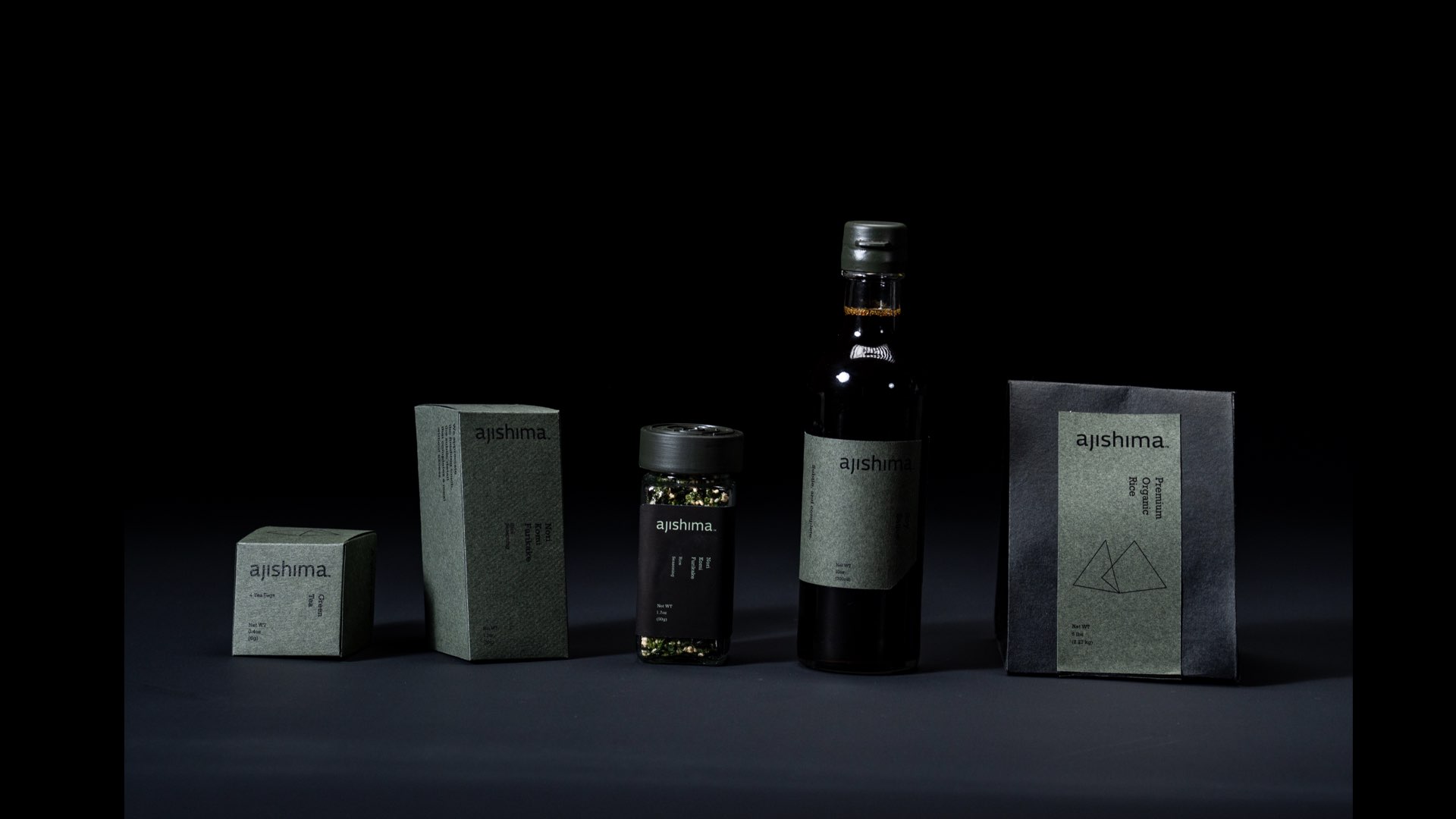
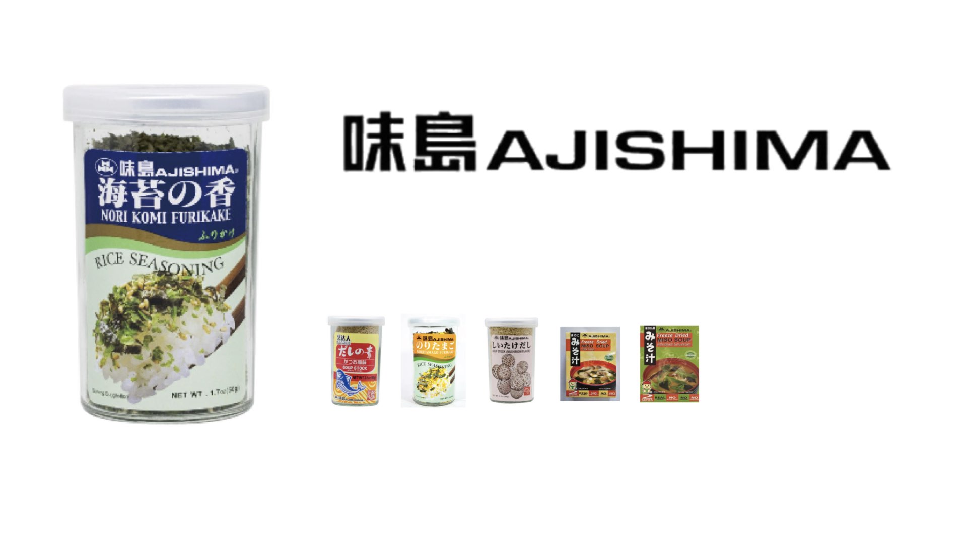
I found that Ajishima’s crowded labels and inconsistent packaging hid the simplicity of its products. I rebuilt the identity around the finishing gesture: a small addition that brings a meal together.
From package to ritual
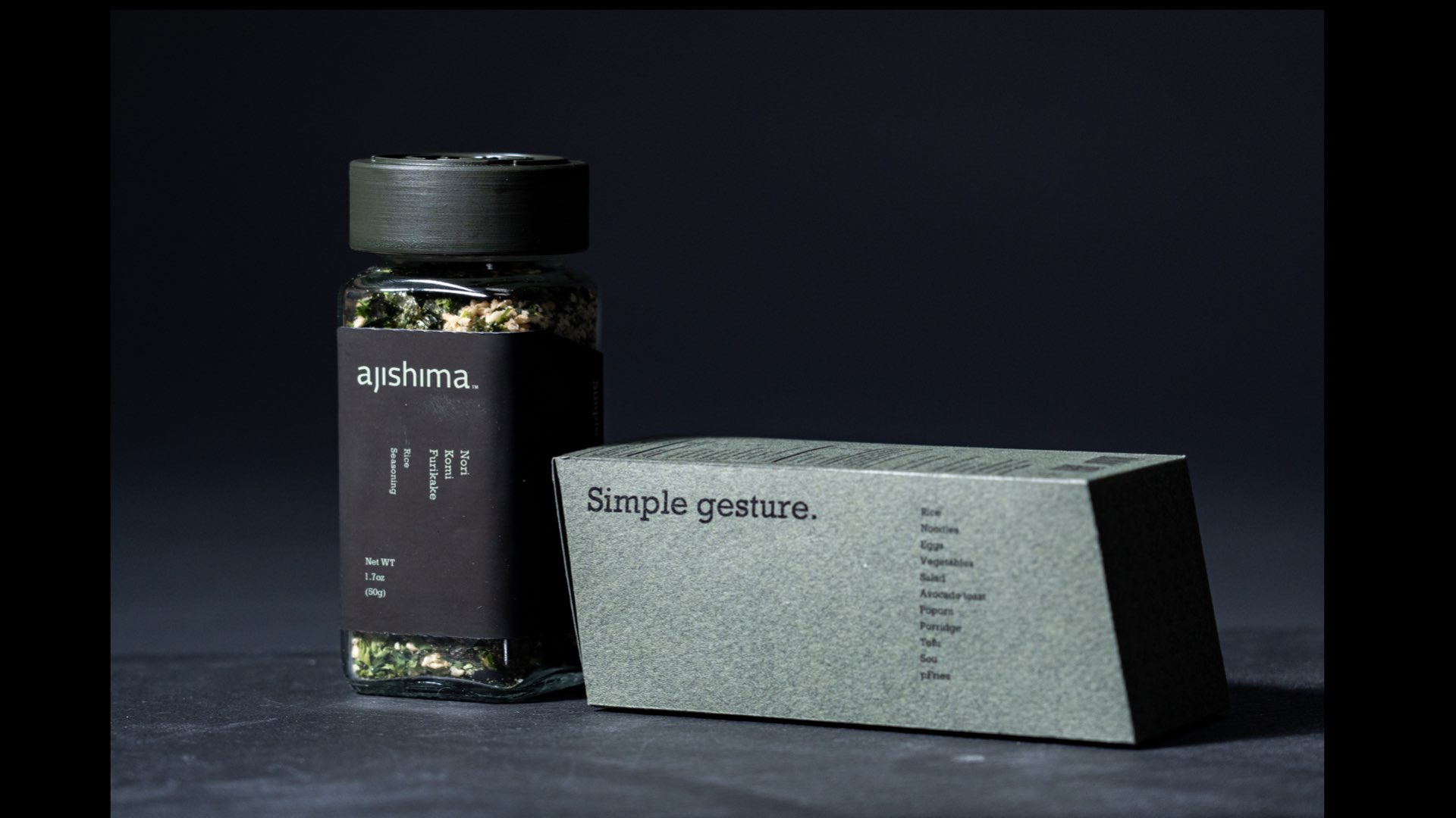
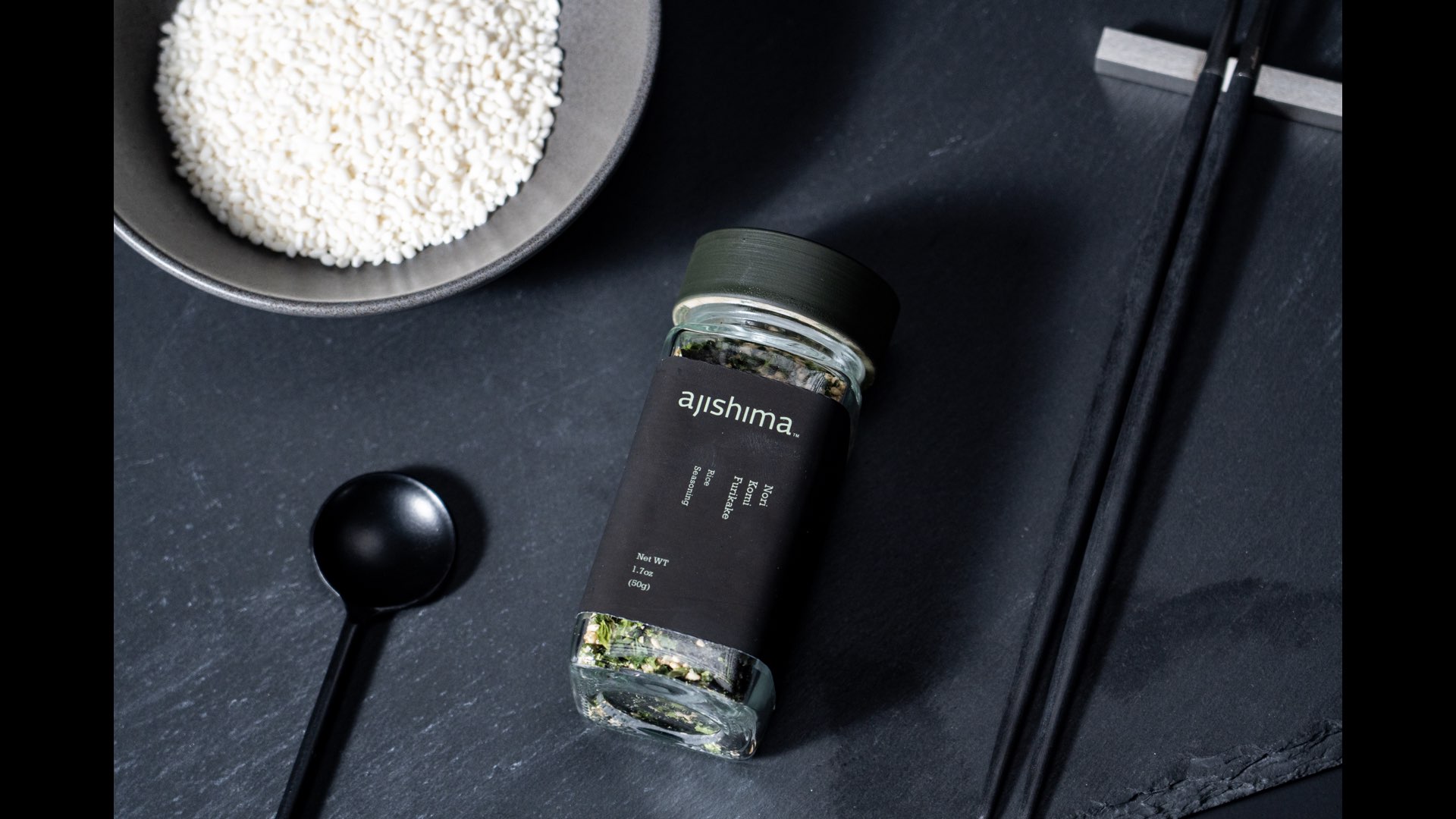
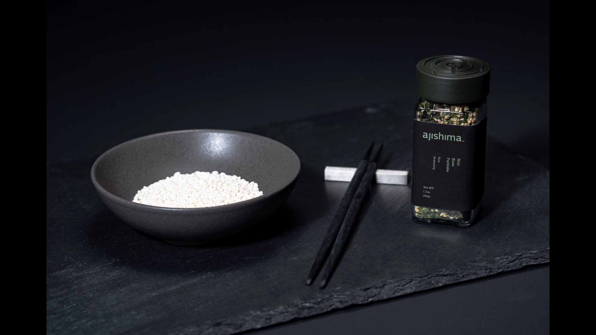
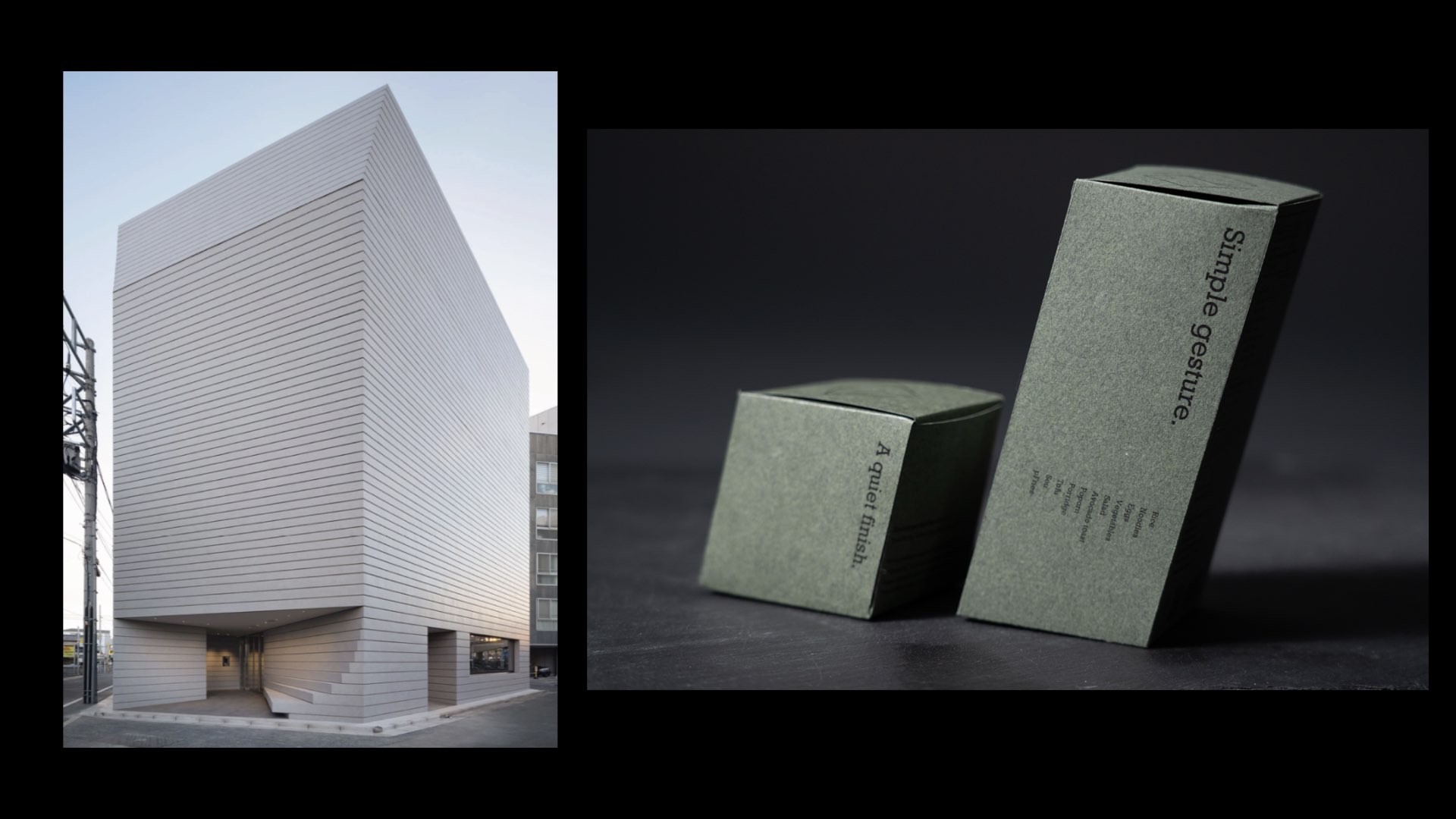
I designed sloped secondary packaging inspired by Japanese rooflines and a small display base that gives the collection a dedicated place in the kitchen. The table setting carries that quiet sense of ceremony into everyday meals.
Details you can feel
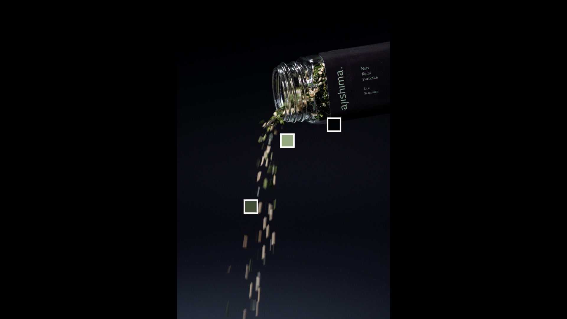
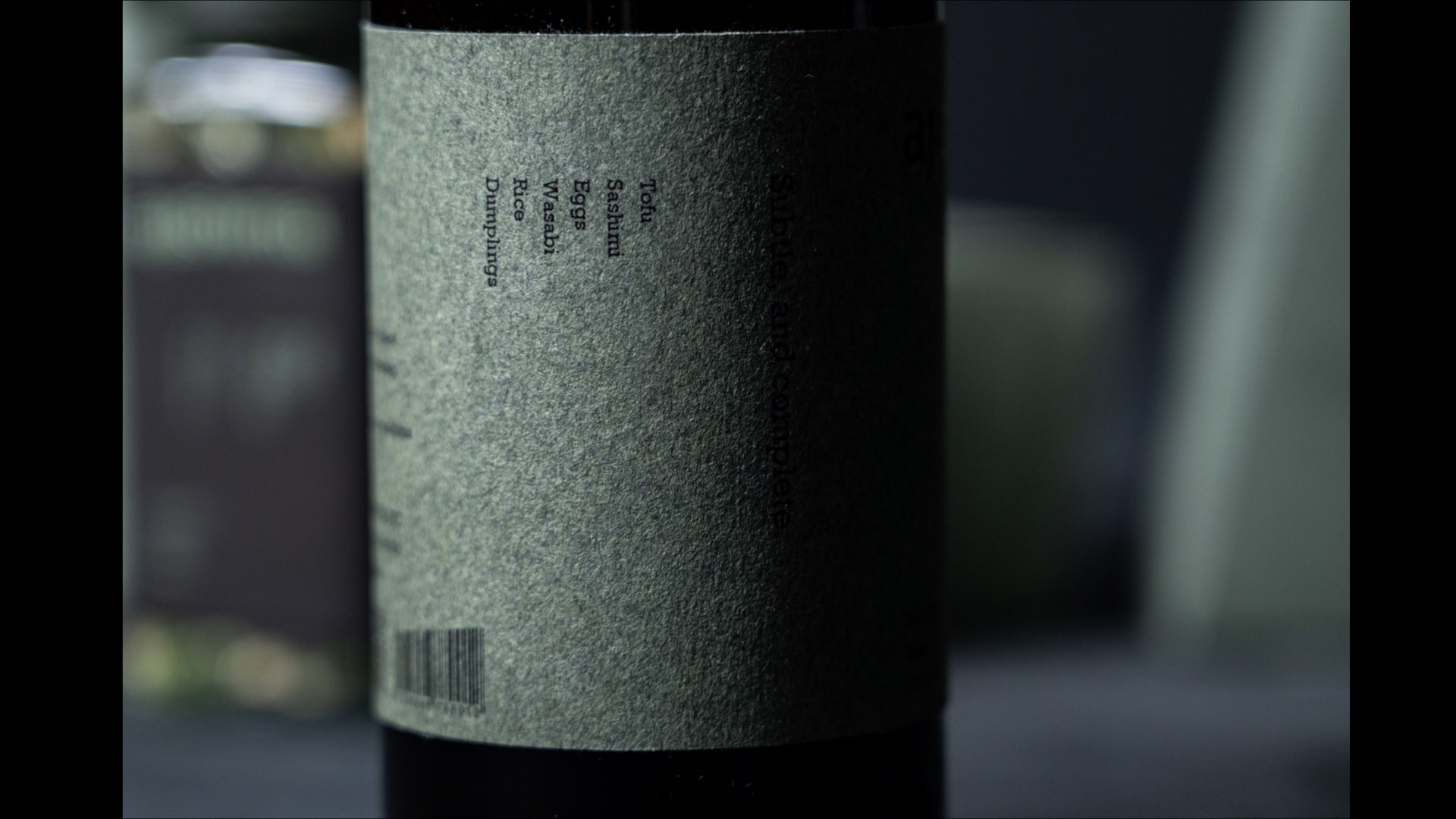
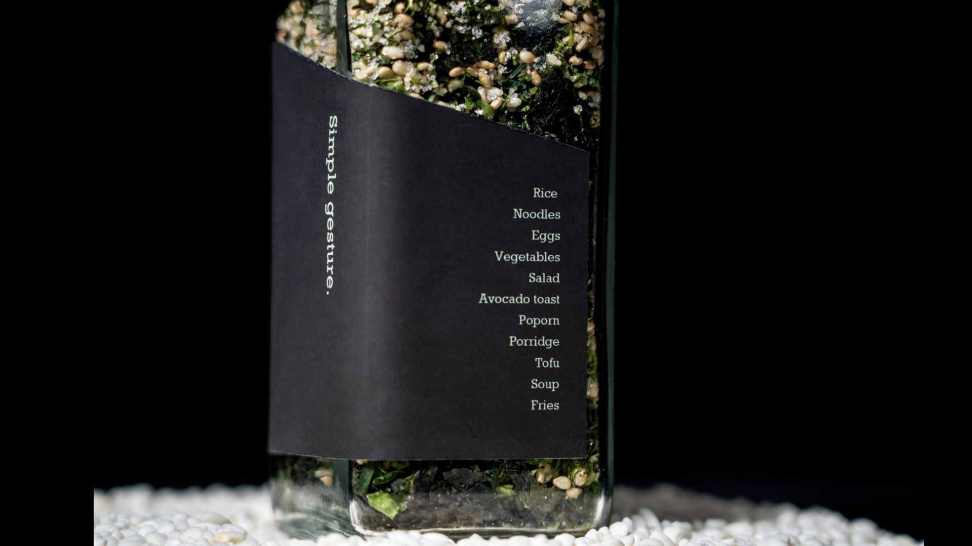
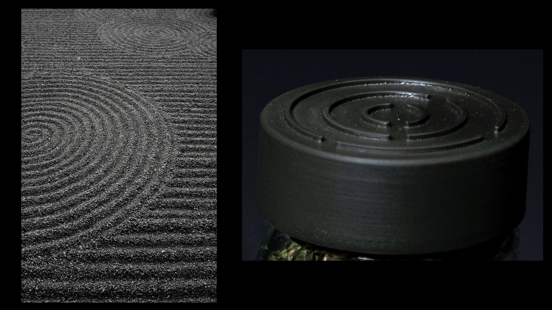
Vertical typography creates a deliberate reading rhythm, while fibrous paper echoes the texture of seaweed. A lid inspired by raked garden patterns brings the same attention to the moment of opening.
A quieter wordmark
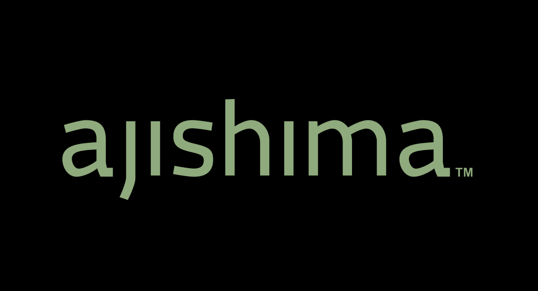
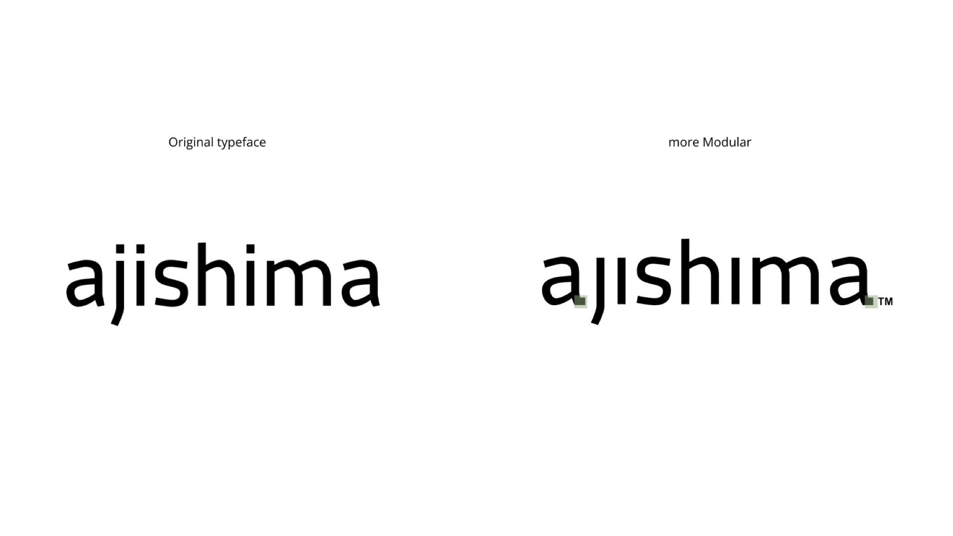
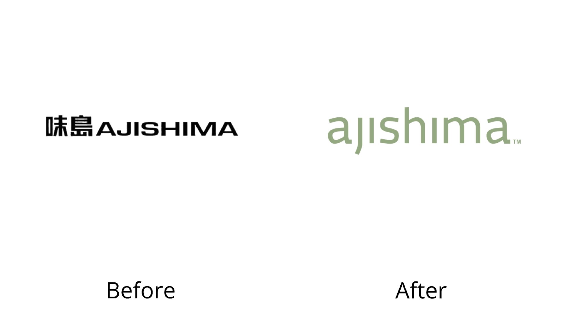
I refined a lowercase wordmark inspired by Macho Modular, giving Ajishima a quieter, more approachable voice. The extended “j” and a subtle tail on the final “a” turn the idea of a finishing gesture into letterform details.
Beyond the bottle
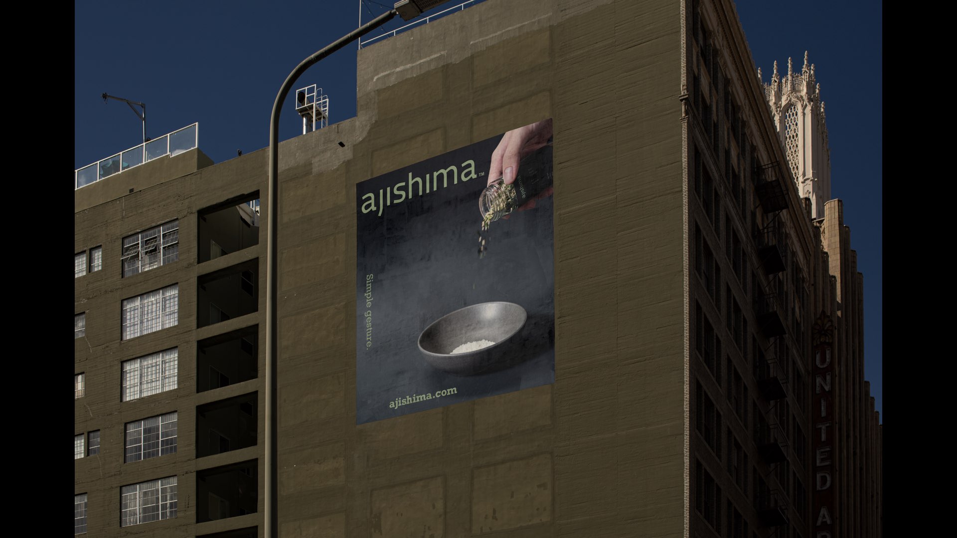
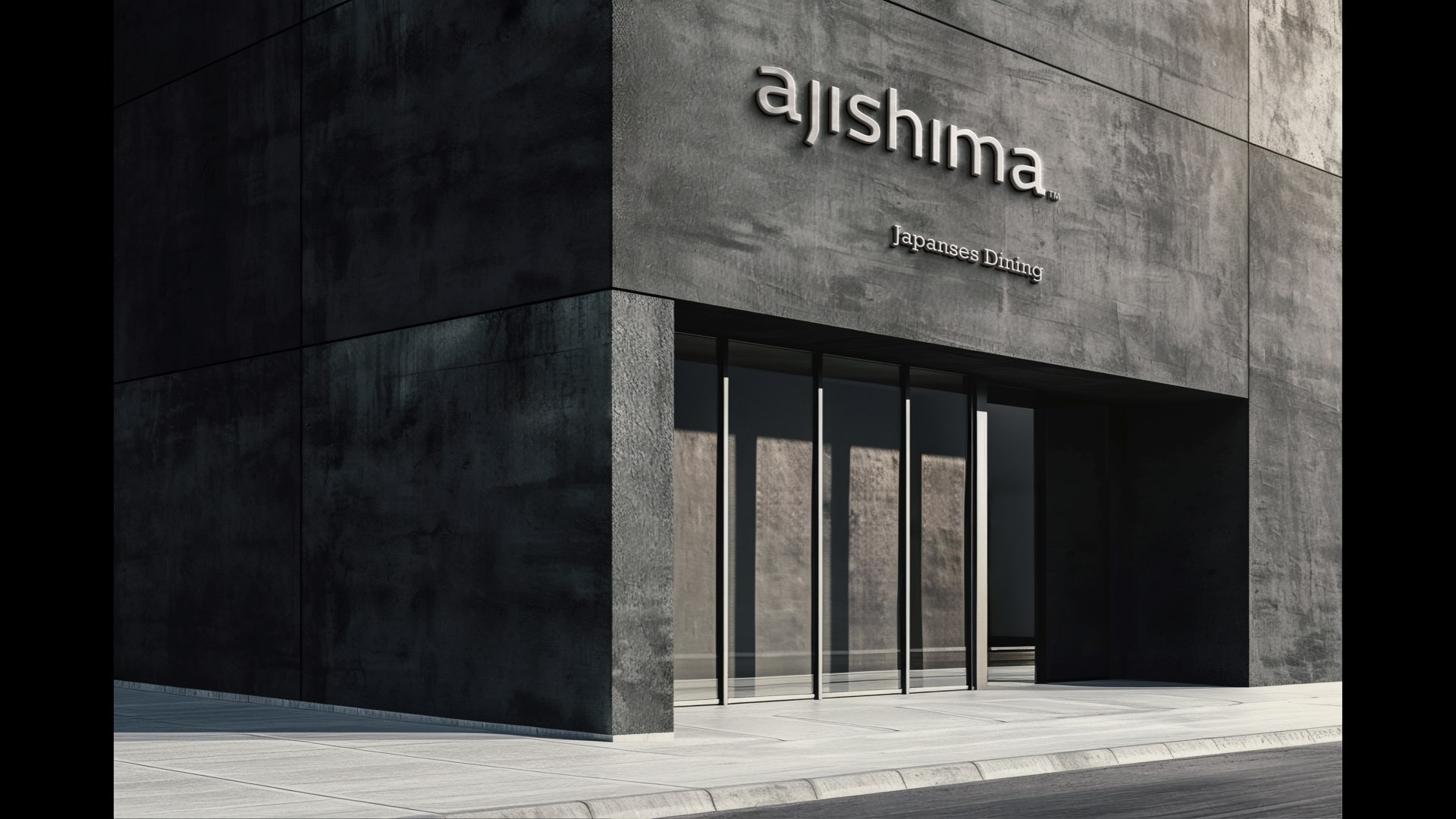
I extended “Simple gesture” into advertising and explored a future restaurant concept centered on furikake. Suggested food pairings invite people to use it beyond rice.
Research into form
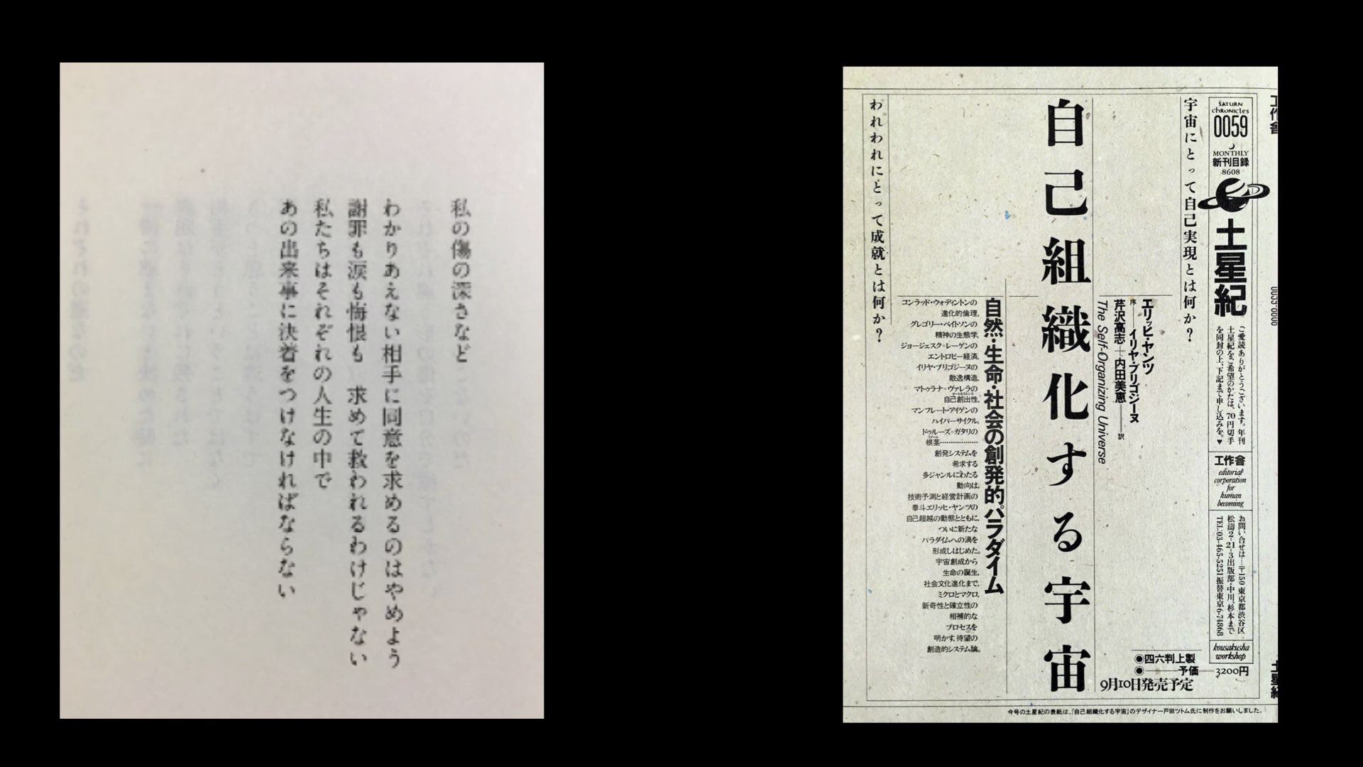
I studied Japanese gardens, architecture, origami and typography, then translated those references into packaging proportions and material choices. Modeling and staged photography helped me present the collection as one coherent experience.